News Implied Volatility (NVIX) Interactive Chart
We construct a text-based measure of uncertainty starting in 1890 using front-page articles of the Wall Street Journal. News implied volatility (NVIX) peaks during stock market crashes, times of policy-related uncertainty, world wars and financial crises.
In the paper we find that in US post-war data, periods when NVIX is high are followed by periods of above average stock returns, even after controlling for contemporaneous and forward-looking measures of stock market volatility. News coverage related to wars and government policy explains most of the time variation in risk premia our measure identifies. Over the longer 1890-2009 sample that includes the Great Depression and two world wars, high NVIX predicts high future returns in normal times, and rises just before transitions into economic disasters. The evidence is consistent with recent theories emphasizing time variation in rare disaster risk as a source of aggregate asset prices fluctuations.
Data and code are available here.
VIX / NVIX


Raw word frequencies

Weighted word frequencies
The chart is interactive: Try placing the mouse pointer over one of the dots, or navigating using the buttons
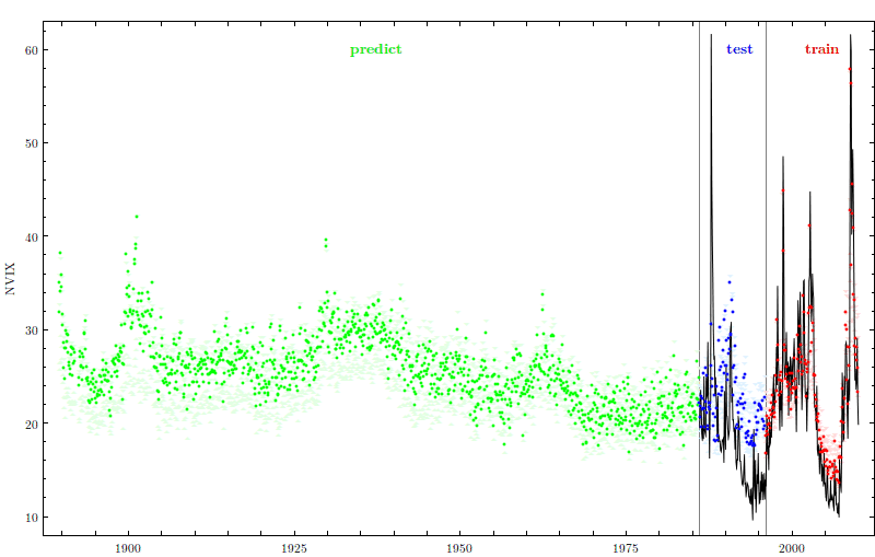
Top figure: Solid line is end-of-month CBOE volatility implied by options VIX. Dots are news-implied volatility (NVIX). The train subsample, 1996 to 2009, is used to estimate the dependency between news data and implied volatility. The test subsample, 1986 to 1995, is used for out-of-sample tests of model fit. The predict subsample includes all earlier observations for which options data, and hence VIX is not available. Light-colored triangles indicate a nonparametric bootstrap 95% confidence interval around the predicted value using 1000 randomizations. These show the sensitivity of the predicted values to randomizations of the train subsample. Bottom-left figure: Word cloud of the raw data on a particular month. Frequently used words appear larger. Bottom-right figure: Word cloud of the weighted words used to predict NVIX. Word size now represents frequency times weight, where red indicates positive and green indicates negative weights in VIX prediction.
Top figure: Solid line is end-of-month CBOE volatility implied by options VIX. Dots are news-implied volatility (NVIX). The train subsample, 1996 to 2009, is used to estimate the dependency between news data and implied volatility. The test subsample, 1986 to 1995, is used for out-of-sample tests of model fit. The predict subsample includes all earlier observations for which options data, and hence VIX is not available. Light-colored triangles indicate a nonparametric bootstrap 95% confidence interval around the predicted value using 1000 randomizations. These show the sensitivity of the predicted values to randomizations of the train subsample. Bottom-left figure: Word cloud of the raw data on a particular month. Frequently used words appear larger. Bottom-right figure: Word cloud of the weighted words used to predict NVIX. Word size now represents frequency times weight, where red indicates positive and green indicates negative weights in VIX prediction.